

This project has been the biggest headache I’ve had since the start of my semester, but also one of my proudest works. After about 2-3 weeks of drawing paths with the pen tool and typing text to follow these contoured paths, I have finally finished my typographical portrait. I am really excited to share my experience with this piece with you guys as well!
THE CONCEPT
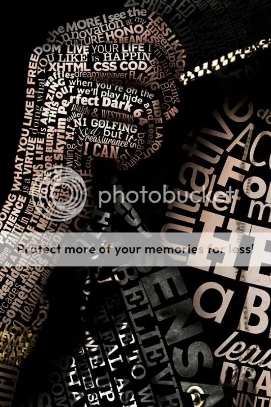
There are A LOT of examples of typographical portraits circulating the internet … some better than others. The majority of the portraits I saw were black and white with bold, blocky text. The few colored ones that I saw were mostly gradient overlay ones. While they looked nice, I wanted my portrait to be a little more substantial than just a gradient thrown on top of regular text. Instead I wanted to go for photo-realism with my portrait (which screwed me over in the long run in terms of work but hey …).
To achieve this, I need a colored photograph with good contrast. I used the photo of me popping my collar from my last photoshoot with Melissa Berrios that I talked about in my last post. The resolution of the photo and the quality of the lighting was ideal for this kind of portrait (and even so, I wish I could have made it much bigger). Plus I thought the pose was very “me.”
THE PROCESS
 I used the “cookie cutter” method to cut out word shaped chunks of my skin and layered them one by one. Using the pen tool, I would draw a path that followed the contour of my face. For example, if I wanted to draw a sentence going down my cheek, I would draw a curved path that would curve down near the nose, then curve up over the cheek, and finally curve back down towards the jaw. This will allow the text to give the illusion of depth without having to manually shade or warp the text to achieve realistic depth.
Using the Type tool, I would then type on this path I created and adjust the size, tracking, and kerning to fit the entire length of the path. Once I got the text the way I want it, I selected the text using Ctrl – Click on the type layer, clicked on the portrait layer, copy the selected area, then paste it above the type layer. I now have an isolated portion of skin isolated on its own layer. I would drag-and-drop it into a folder called “Keep” and drop the original type layer into a folder called “Type” in case I need to revisit and adjust the word later down the road.
And then … rinse and repeat several hundred times!
DETAIL SHOTS
In case you guys were wondering, yes, every word, phrase, and sentence was unique! I avoided repeating anything at all costs. So you can imagine I spent countless hours just trying to figure out what else to say about me. Below I will show you some of the details that get lost in the zoomed out, minimized version above.
Hopefully you guys enjoyed walking through this process with me. As always, your support is highly appreciated. Leave a comment and follow my blog for more design posts, features, and awesome ideas!


That is AMAZING!! Really well done, I’m not surprised you’re proud of it!
Thank you Emma! Your support is highly appreciated. =]
Reblogged this on KarolineDesigns and commented:
Pretty impressed by this artwork!
Wow! Johanan this is amazing. I love the final product.
Thanks Melissa! =D And thanks again for your hand in this project!
Its always a pleasure working with you =)
Absolutely brilliant! The details are fantastic! Great contour and dimension.
Thanks Wayne! I appreciate your feedback. =]