
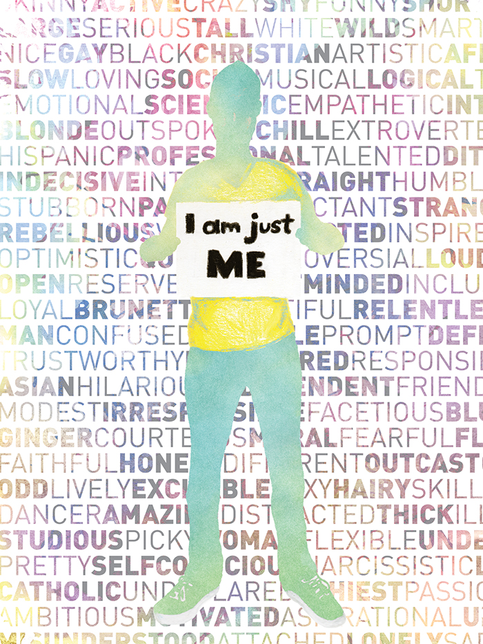
“No Labels” is an 18″ x 24″, mixed media poster I made for the Healing Art exhibition, hosted by the counseling center at the University of Central Florida. The theme for this academic year is “The Journey to Self-Acceptance.” Since this entry was all about reaching into my soul and self-expression, I took this opportunity to bust out my Prismacolor pencils and go wild with it.
Creating a submission for the Healing Art exhibition has been a tradition for students in the graphic design program for a couple of years now. The professor assigns us the project and has a counselor from the counseling center come in and discuss what the theme is all about and how the submission process works. Victor, my graphic design professor, only gives us one rule for this project: typography must be somehow incorporated into the work.
The Concept
The idea behind this illustration is that we live in a society where labels mean everything. We allow labels to define us. To describe us. To imprison us. Anybody can plug one or more of these words after “I am” but that doesn’t mean they should. We should pride ourselves in being unique, even when it seems we fall into a certain “group” or “characteristic.” Love yourself and accept yourself for being you because at the end of the day, you are not a word, but a person.
The Process
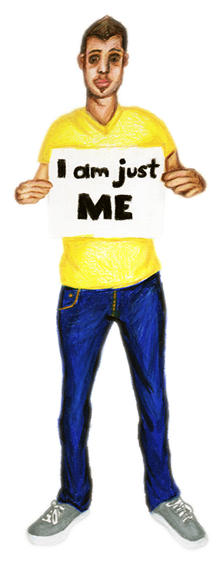
This project was more labor intensive than it was process involved, so there really isn’t much to go over in terms of how I put this together. I took a picture of myself holding a blank bristol board, printed it, then used as a reference in my illustration. Ironically, I actually colored myself on the same piece of bristol board paper I held up in the photo. Once I finished the illustration, I scanned it in at 600 DPI so I can blow it up to a large poster size. The sharpness and crispness of quality wasn’t too important though because I planned to hide my likeness using layer blending modes. What matters is that the graininess and texture of the pencil strokes shows through (which is especially evident in the shirt).
The words in the background were created in Illustrator. It’s a simple sans-serif with different weights. Once I covered the entire canvas in words, I brought them in as a smart object into Photoshop behind my illustration. After the illustration and words were set in place, I placed scans of watercolor paint splatters above the image and clipped them to the layers I wanted to apply the the new color and texture to, such as the text, then used layer blending modes to hide the paper background and shift the hues instead. Same concept for my silhouette, only I made sure some of the painting work still shows through the watercolor.